Trippy Goat
& The Mixer
Building a brand identity, developing a brand strategy and growing a loyal customer base for Trippy Goat, in the heart of Bangalore, attracting customers drawn to fusion cuisine paired with wine blends from around the world — and the event brand, The Mixer, that grew out of it.
A wine bar in a city that drinks coffee.
Trippy Goat sits on Hatworks Boulevard, off Cunningham Road in Bengaluru — a cafe and wine bar serving fusion food against wine blends from around the world. That is a difficult position to hold. A cafe is a daytime habit with a low ticket and high frequency. A wine bar is an evening occasion with the opposite economics. Most venues that attempt both end up reading as neither, and get treated as a coffee shop that happens to stock wine.
I came in as design consultant with the identity unbuilt, and the scope ran from the mark itself through menus, packaging, photography and social — and then into a second brand that the first one produced.
Two businesses, one room, one identity being asked to carry both.
The brief arrived as “build the brand.” The actual problem was narrower and more awkward: the venue needed to be legible as a cafe at 9am and as a wine bar at 9pm, without running two identities that would halve its recognition in a market where nobody yet knew the name.
So the question I worked to was not what should this look like but what stays constant when everything else changes — because the answer to that decides whether a menu, a bottle label and an event poster read as one business or three.
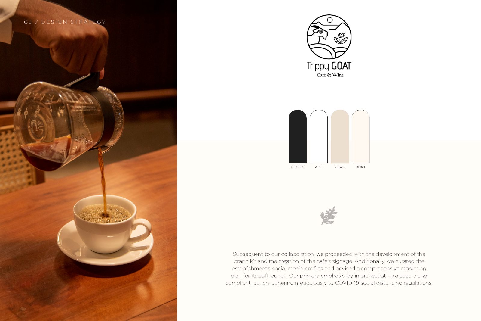
Fix the mark. Let the temperature move.
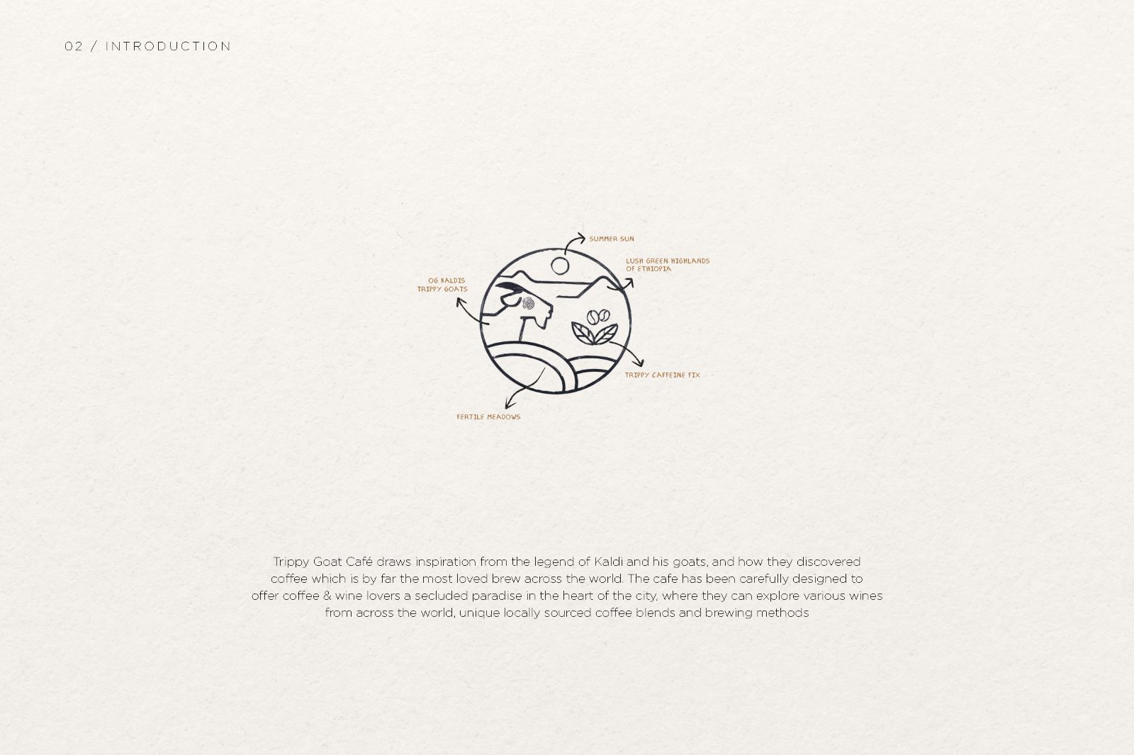
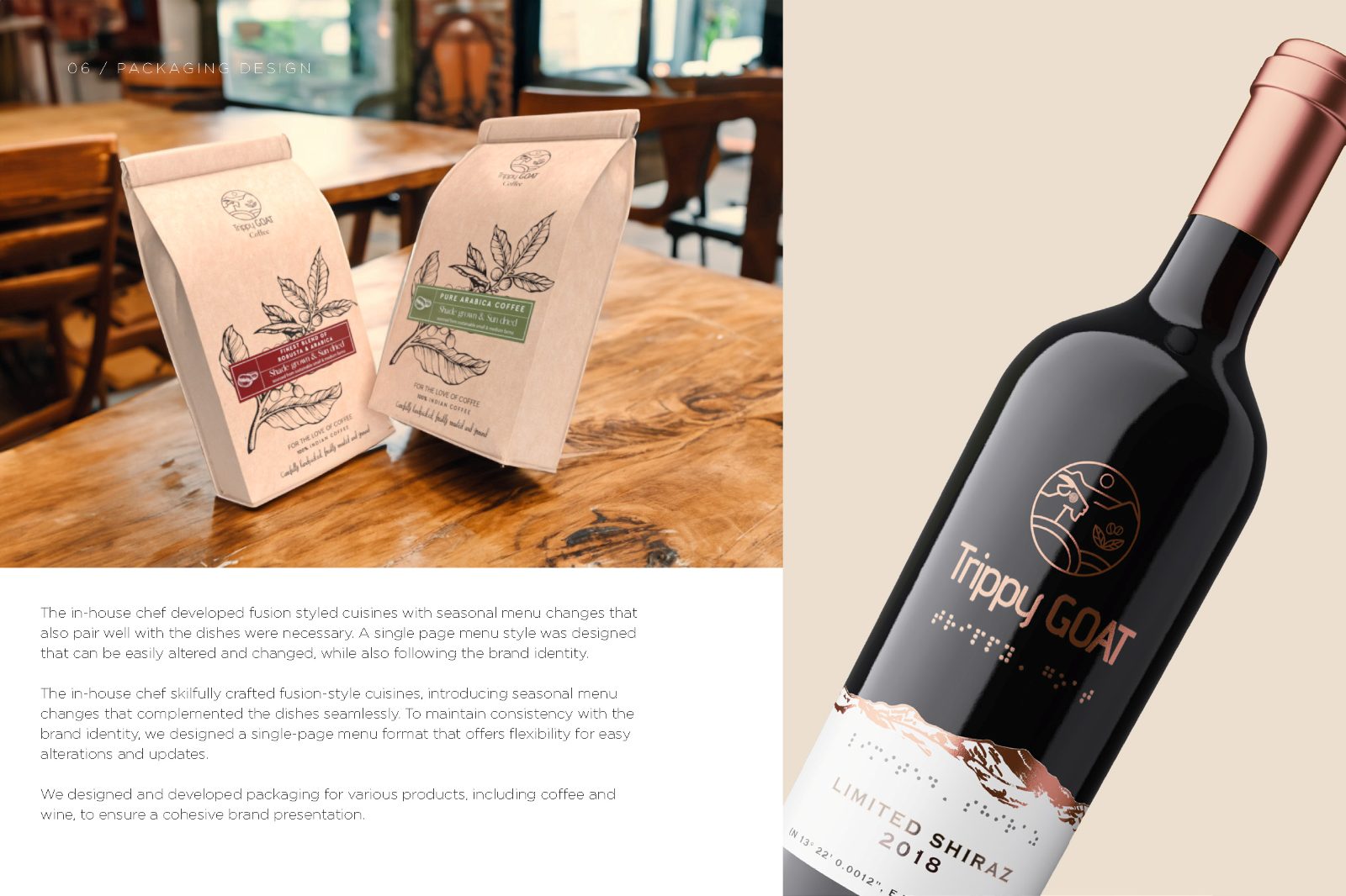
The constant became the roundel — the goat, the hills, the coffee cherry, held in a single circular lockup that survives being stamped, embossed, printed small on a cup and blown up on a wall. Everything else was allowed to move: warm and photographic for daytime coffee, dark and typographic for evening wine.
That is a trade-off, and worth naming. A single fixed palette would have been faster to apply and harder to get wrong, especially for staff producing day-to-day posts without a designer. I took the more expensive option because the alternative forced a choice between the two halves of the business, and the business was not willing to make that choice — correctly, in my view, since the wine list was the margin and the coffee was the footfall.
The system produced a second brand.
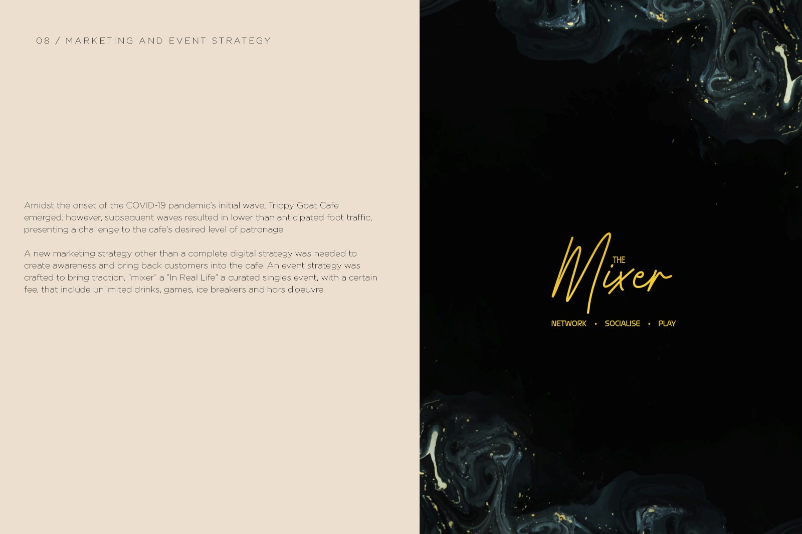
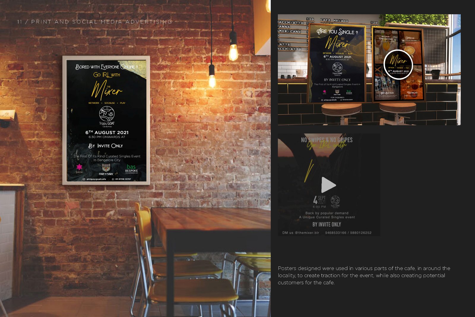
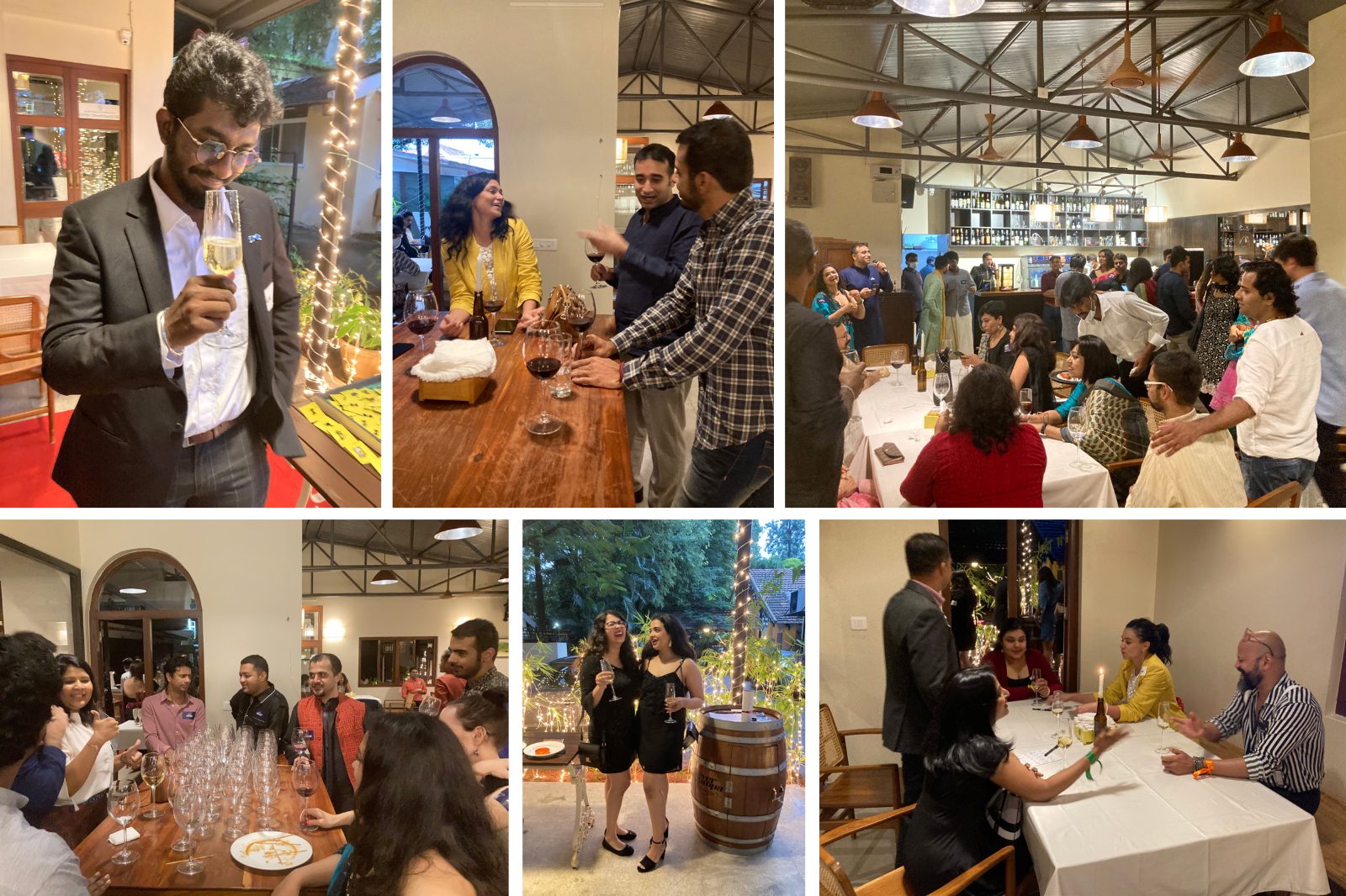
Because the identity was built to flex rather than to be applied, the venue could host formats that a fixed brand would have rejected. The clearest case is The Mixer — a networking series the cafe ran, which drew a different crowd on a different night and eventually needed to stand on its own.
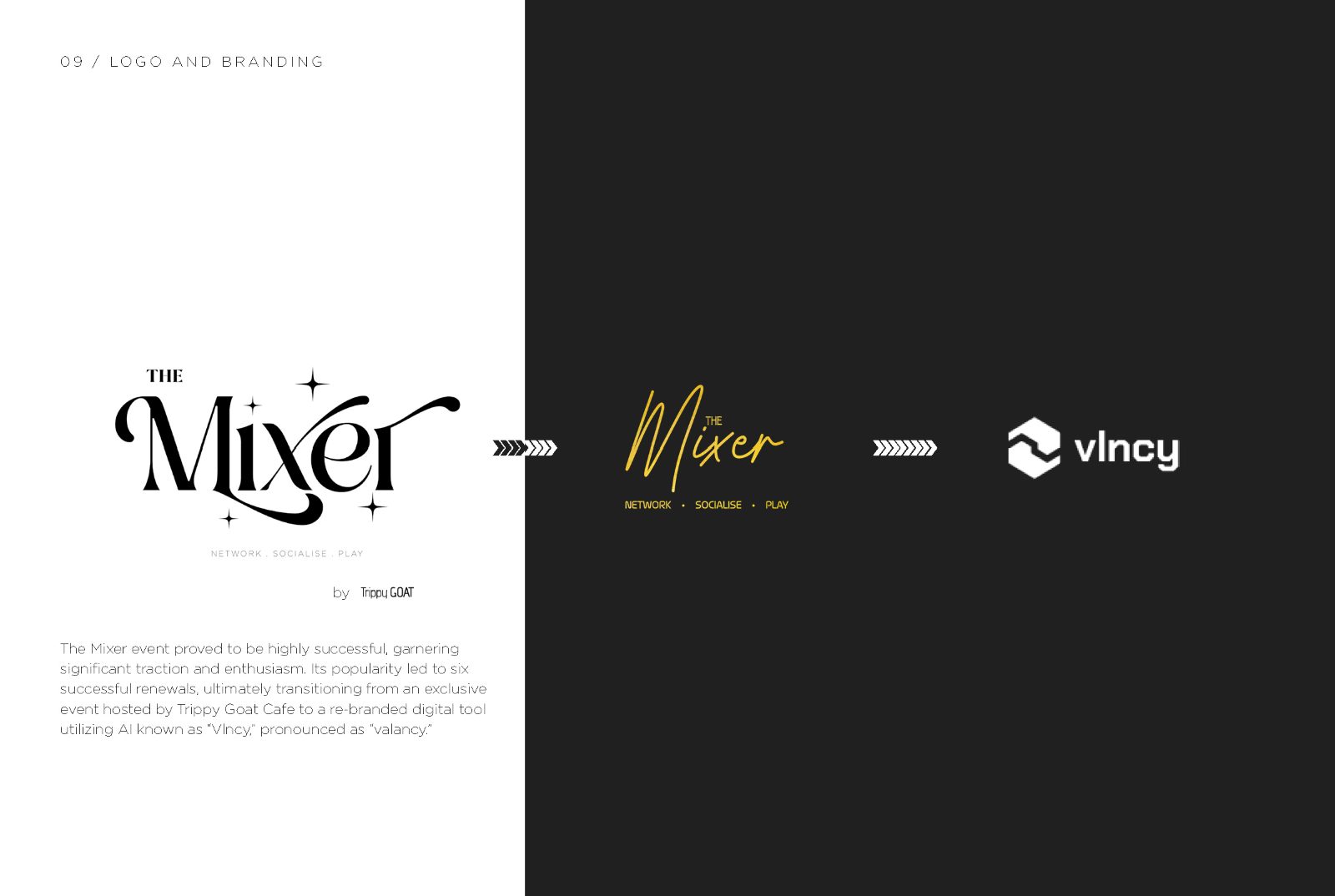
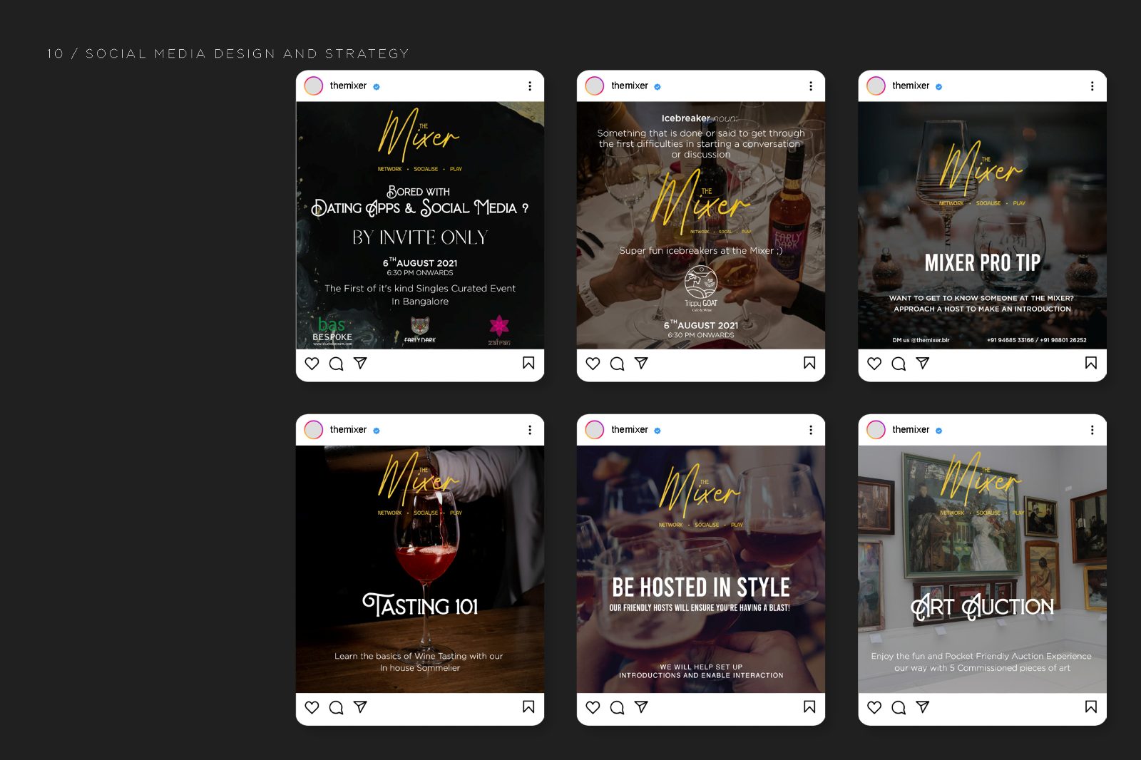
The Mixer got its own mark and its own campaign, deliberately colder and more graphic than the parent, and co-branded with partners including Vinoy. It was designed as a sibling rather than a sub-brand: it could appear without Trippy Goat and still make sense, which is what let it outgrow the room it started in.
- 01Overview
- 02Introduction & logo construction
- 03Social media design
- 04Menu design
- 05Photography
- 06Marketing & event strategy
- 07Logo & branding — The Mixer
- 08Social media design & strategy
- 09Creative direction & event
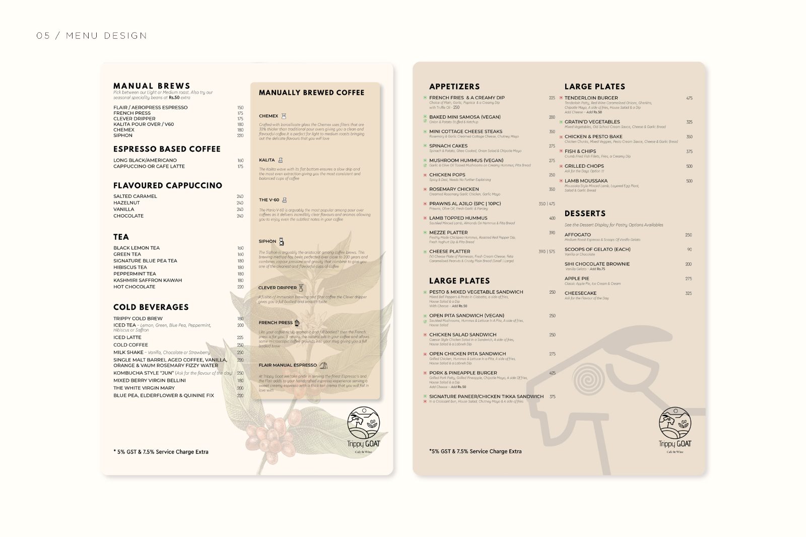
Fourteen spreads, front to back.
A chef's table, worked through in full.
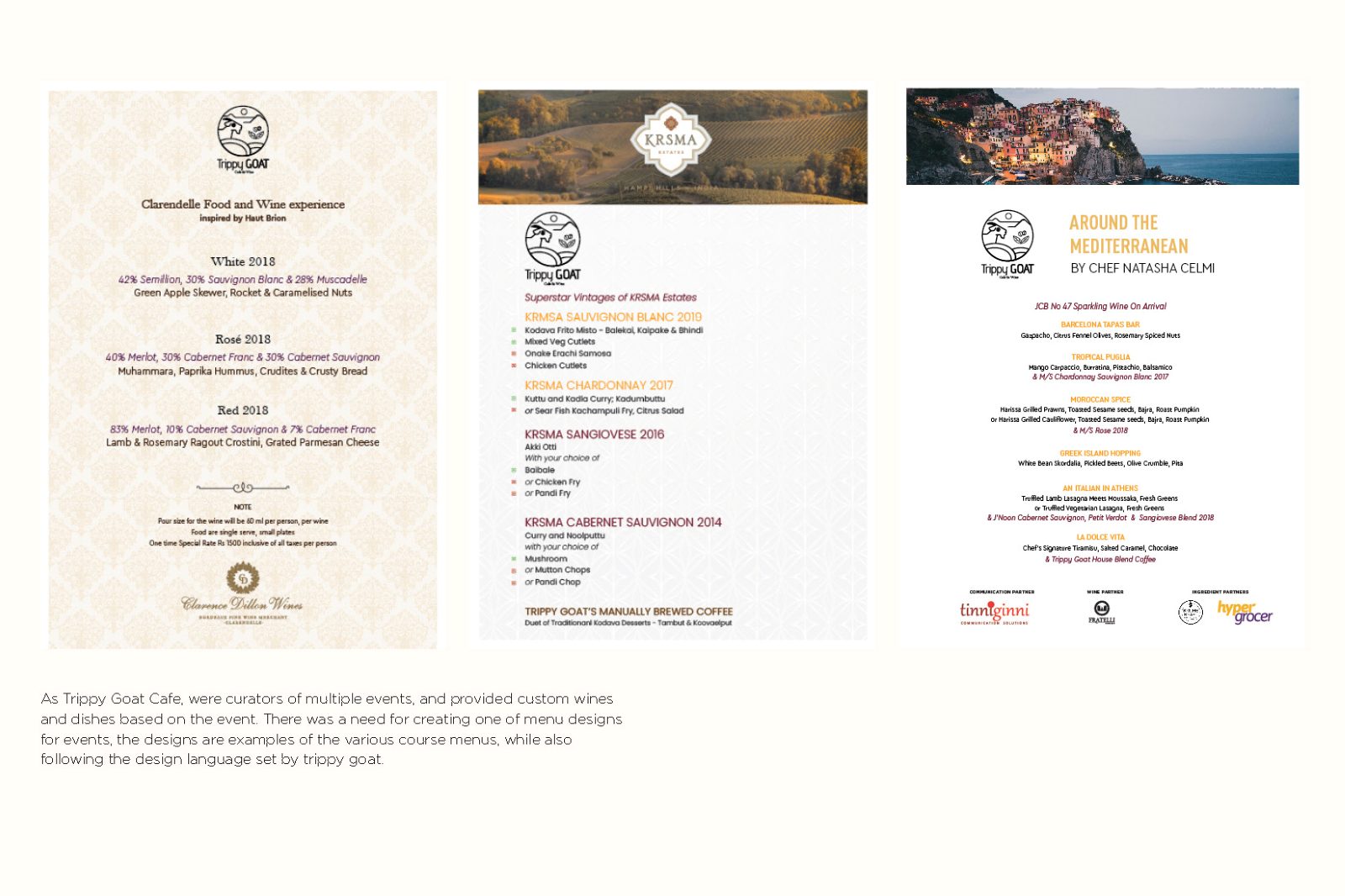
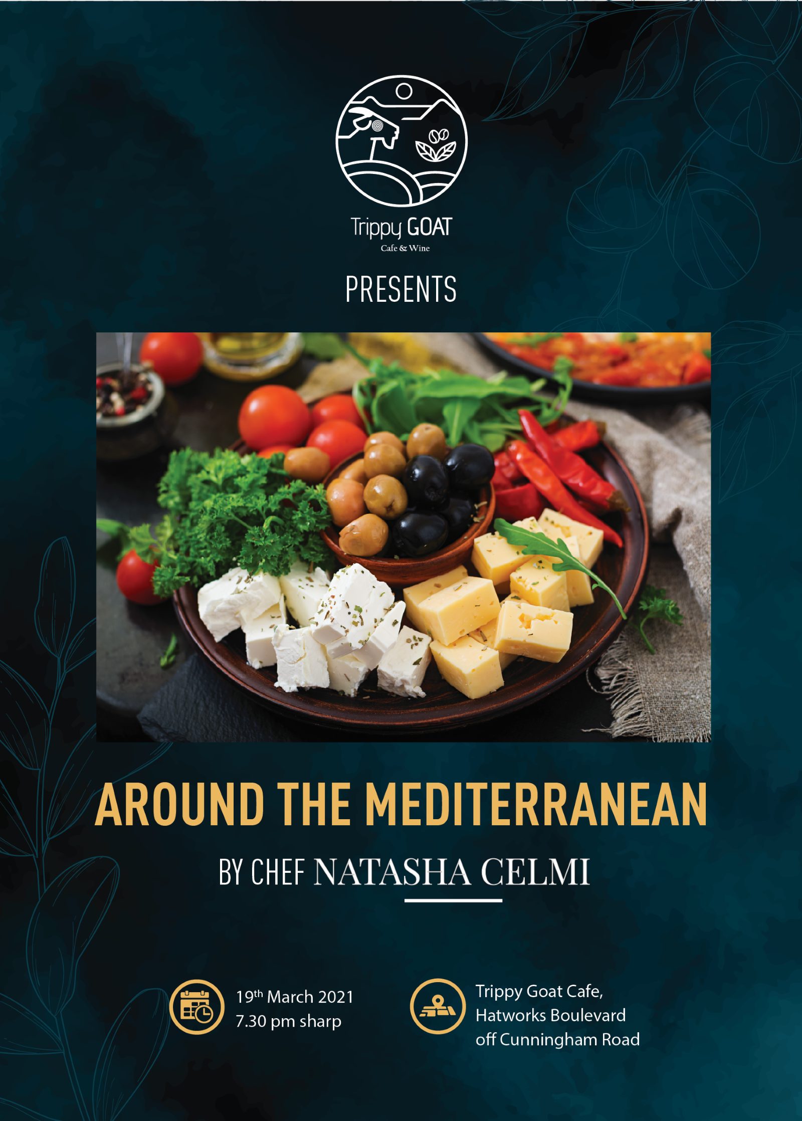
One evening from the programme, shown end to end: Around the Mediterranean with Chef Natasha Celmi, 19 March 2021. The invitation leads with the food against a deep teal ground; the menu inverts it, near-white, with illustrated motifs stepped back so the six courses carry the page.
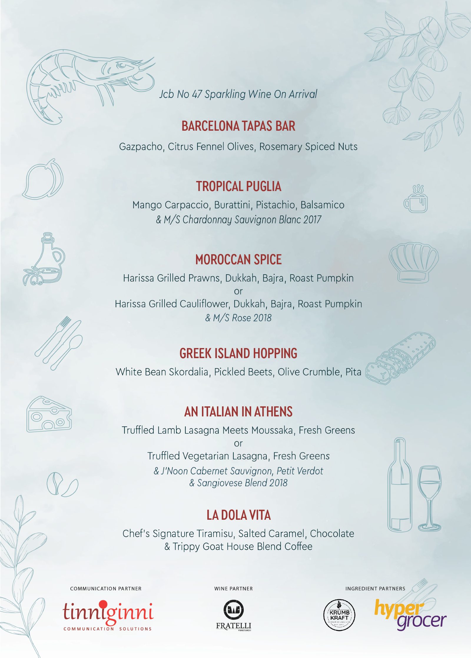
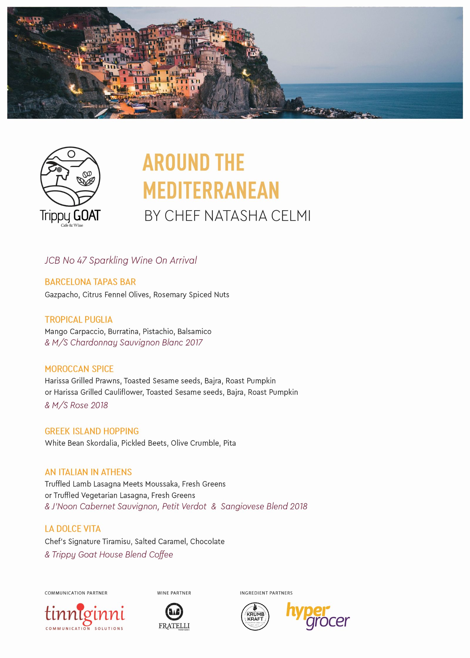
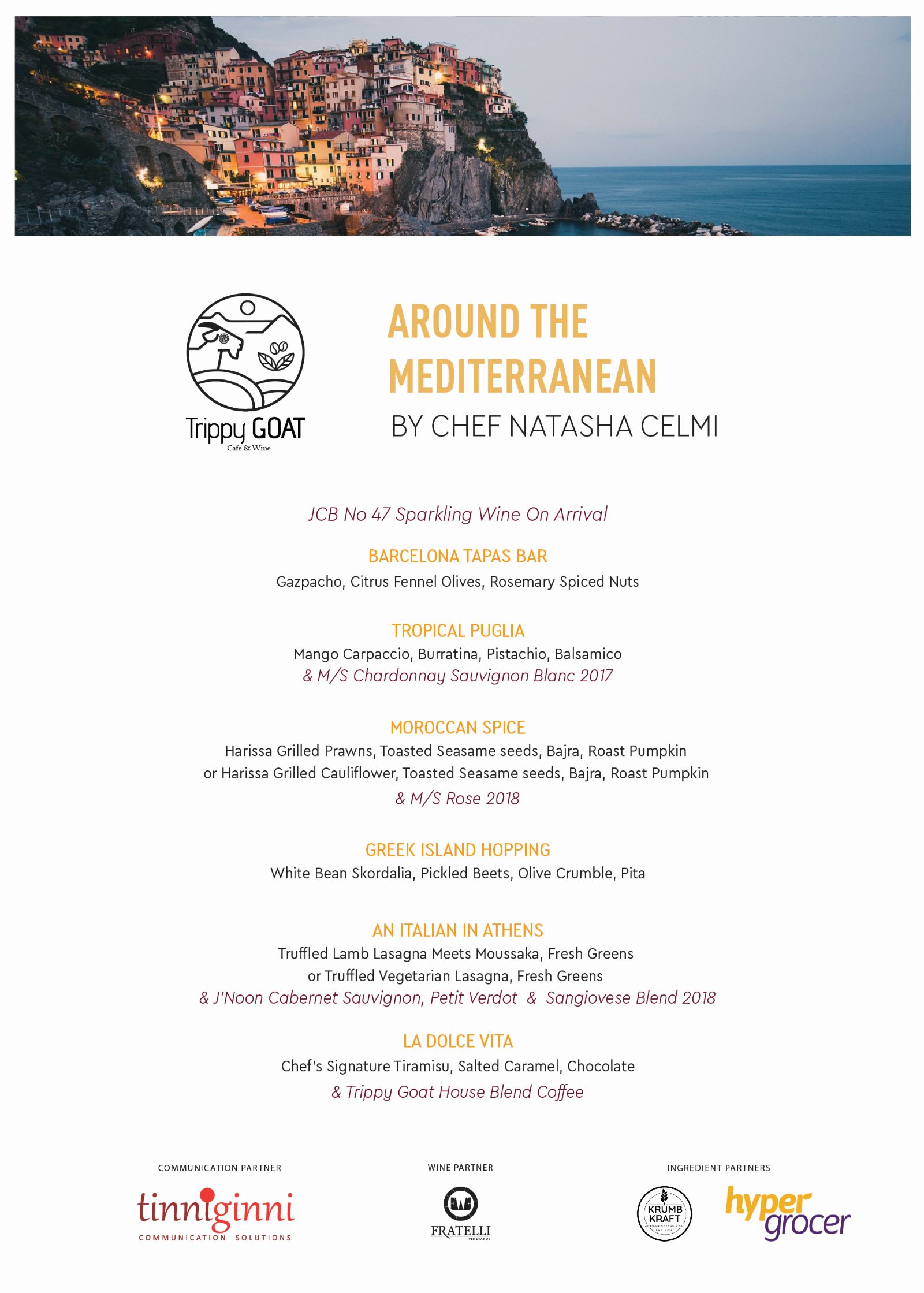
Barcelona Tapas Bar, Tropical Puglia, Moroccan Spice, Greek Island Hopping, An Italian in Athens, La Dolce Vita — each course named for where it lands rather than what it is. Produced with Tinn Ginni as communication partner, Fratelli as wine partner, and Hyper Grocer among the ingredient partners.
What shaped the work as much as the brief did.
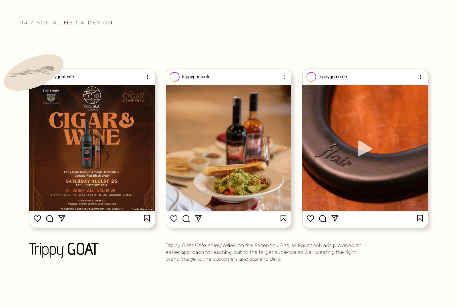
No in-house designer. Everything had to be producible by staff between services, which is why the social system is built from a fixed grid and two type sizes rather than bespoke layouts.
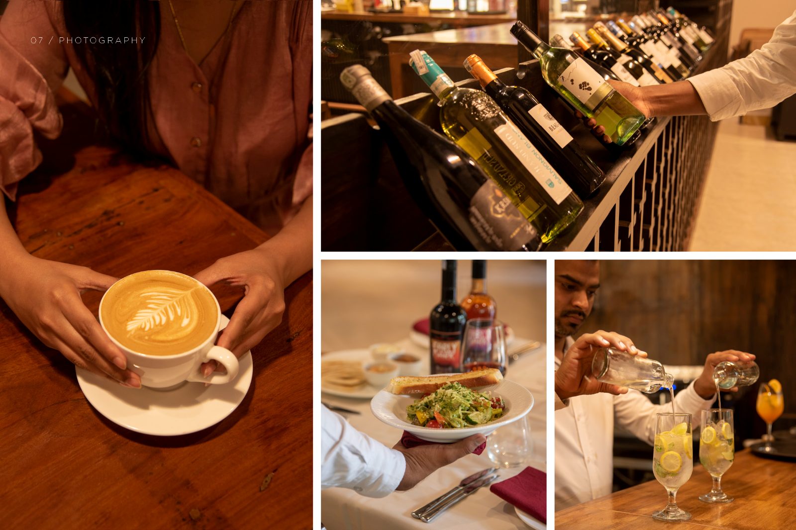
Photography had to be made, not bought. A fusion menu that changes has no usable stock library, so the shoot was part of the identity work rather than a separate commission — and the grade became a brand asset in its own right.
Partner co-branding. The event work carried Tinn Ginni as communication partner, Fratelli as wine partner and Hyper Grocer among the ingredient partners. Four logos on one invitation is a hierarchy problem before it is a layout problem.
Honestly: the artefacts are documented, the numbers are not.
The identity shipped across menus, packaging, the bottle, social and a full event programme, and it produced a second brand that ran on its own. What I do not have is the commercial data — covers per night, event attendance, the shift in daytime-to-evening revenue — because it was not instrumented at the time and I was not in a position to instrument it.
I would rather say that plainly than reverse-engineer a number. The verifiable claim is one of range and coherence: fourteen spreads, two related identities and one event series, all legibly from the same hand.
What I would do differently.
I would agree the measurement before the design. Even two numbers taken monthly — evening covers and event sign-ups — would have turned a body of craft into a body of evidence, and the cost of collecting them was close to zero.
I would also write the flexing rule down. The warm-to-dark shift lived in my head and in the artefacts, not in a guideline, which meant it held while I was producing the work and started to drift once others were. A one-page rule for which temperature applies when would have outlasted the engagement.