Socials
“The Socials” is an event organised by the team known as the Mixer. They hosted a trial event to gauge demand for a networking-only gathering, which needed a design kit with a fresh, contrasting colour theme distinct from the existing Mixer identity.
A trial event, run to find out whether a format had demand.
“The Socials” was organised by the team behind the Mixer. It was a trial: a networking-only gathering, with no other draw attached, run to gauge whether that proposition could stand on its own.
The scope was a design kit and identity, deliberately distinct from the Mixer’s.
A test that its own branding could invalidate.
The Mixer’s identity is dark and gold, and it carries an established association. If Socials had inherited that palette, any turnout would have been ambiguous — impossible to say whether people came for networking or because they already trusted the Mixer.
So the design had a job beyond looking right: it had to keep the experiment clean.
Share the discipline, share none of the colour.
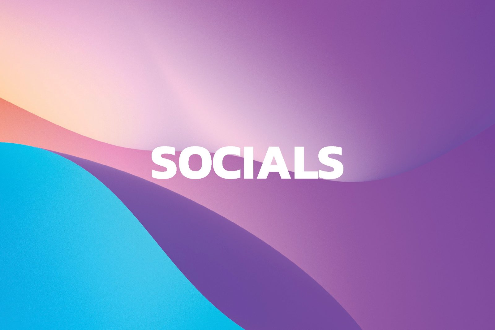
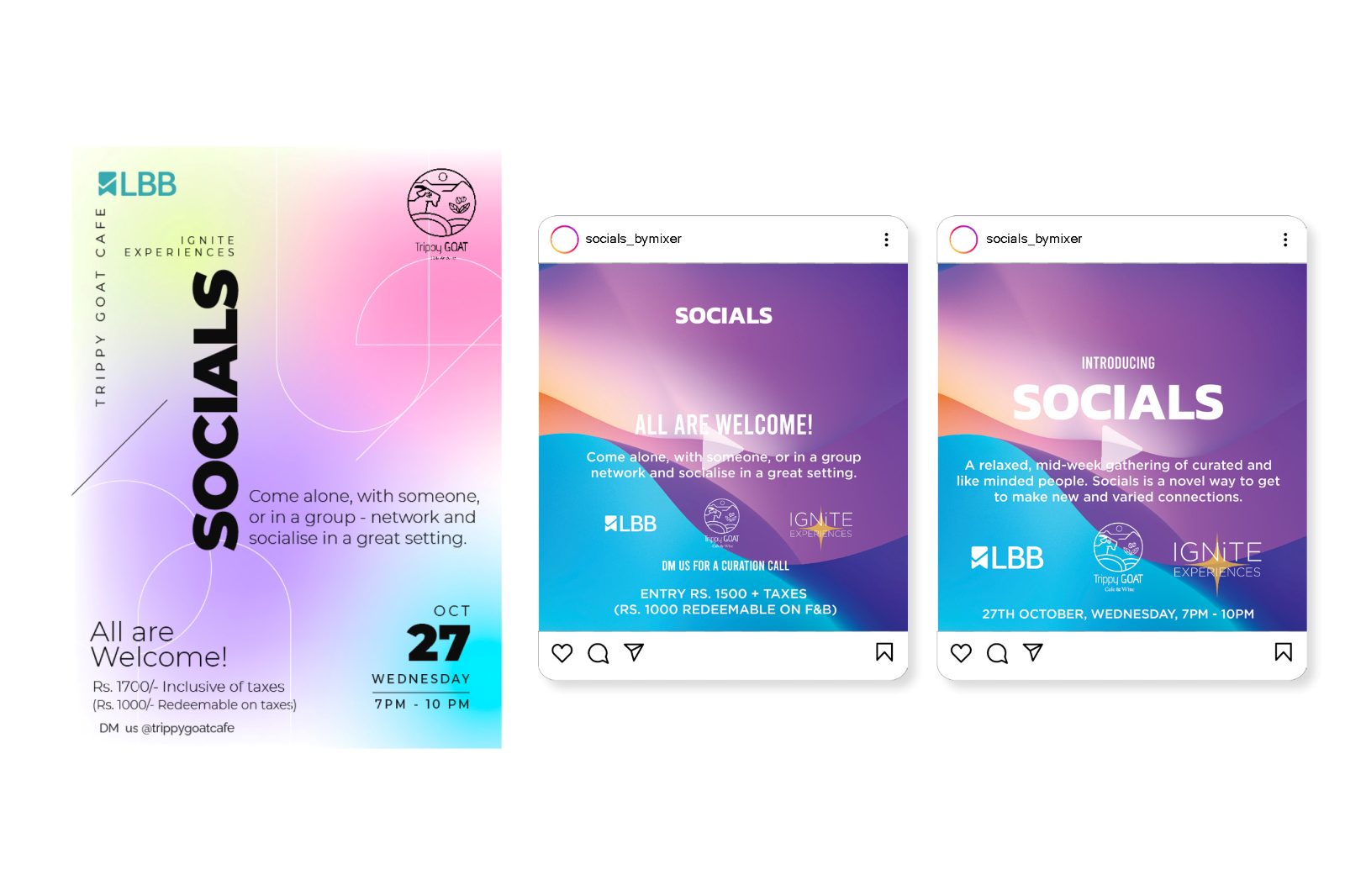
Socials moves to a cyan-to-violet gradient that has nothing in common with the parent palette, while keeping the same typographic discipline and structural logic. Same hand, different proposition.
The cost is that recognition starts from zero and the kit borrows no equity from a brand that already had some — measurably harder work for the same turnout. I took it because a contaminated result would have been worth less than a smaller honest one.
A readable answer, and a second identity out of it.
The campaign ran with LBB, and the assets carry an open invitation — come alone, with someone, or in a group — written to remove the social cost of turning up by yourself, which is the real barrier to a networking-only event.
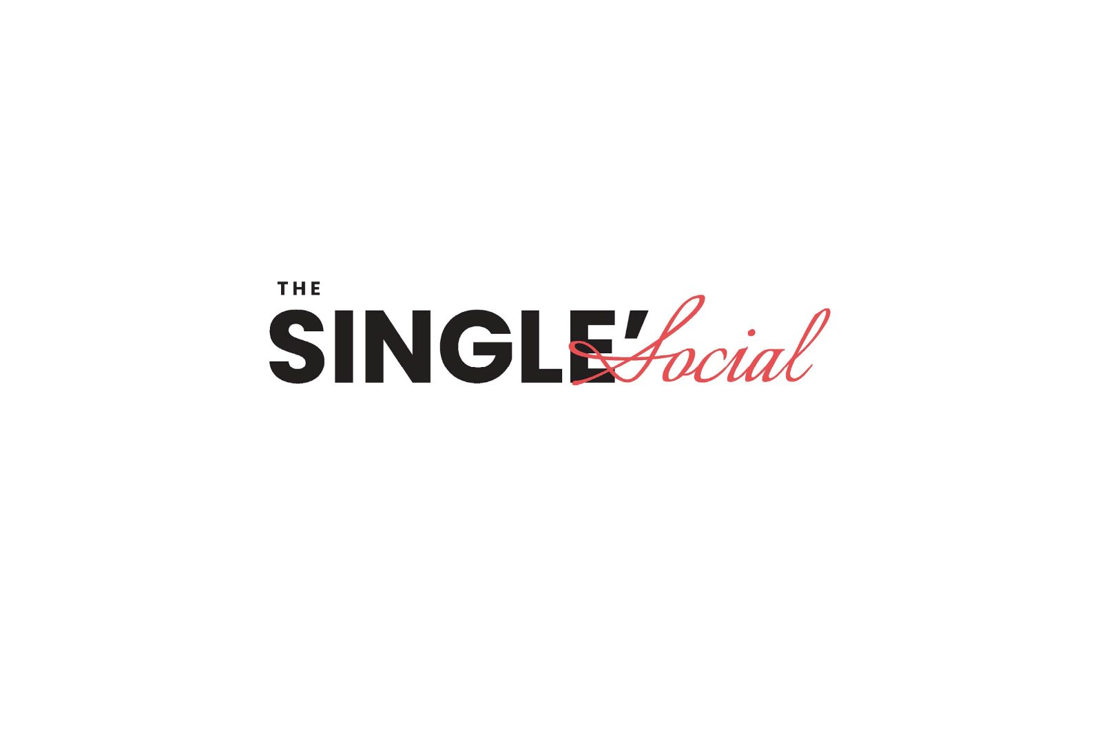
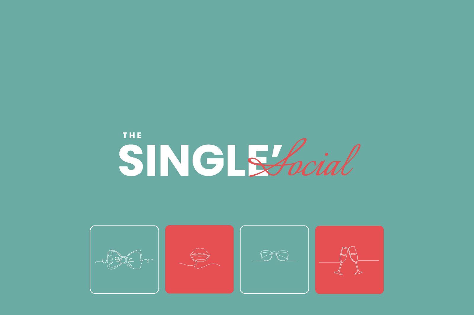
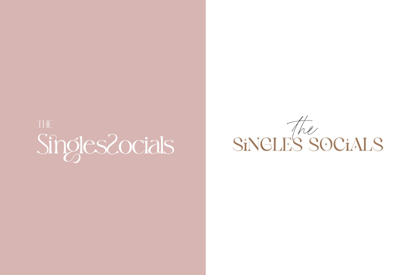
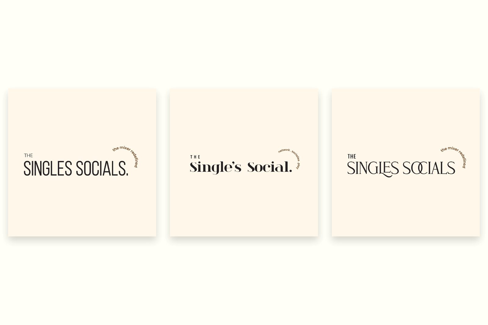
A second strand in the document takes The Single’s Social through wordmark, colourways, script variants and an icon set — a related format that the first one made it possible to imagine.
Eight pages, front to back.
What shaped the work as much as the brief did.
Trial budget, trial timeline. A test event does not get a full launch spend, so the kit had to be built from a gradient and type rather than from photography or illustration.
A media partner’s formats. Running with LBB meant designing to their placements and crops rather than to my own.
Copy had to do emotional work. “Networking only” is an unappealing promise to a person deciding whether to attend alone; the invitation line is load-bearing, not decorative.
The kit shipped and the event ran. The demand signal is not mine to report.
Eight pages of identity and campaign assets, plus the Single’s Social exploration. Whether the trial proved demand is a question about attendance and repeat interest, and those numbers sat with the organisers and were never shared back to me in a form I can cite.
I will not estimate them. The design claim stands on its own: a sibling identity that could be tested without its parent skewing the result.
What I would do differently.
I would agree, before designing anything, what number would count as demand proven. The entire point of the event was to answer a question, and a question without a threshold cannot be answered — which is a design problem as much as a business one.
I would also test the invitation line. It is the one asset doing persuasive work, and it went out on instinct.