Jumbofarms
Mustard Oil
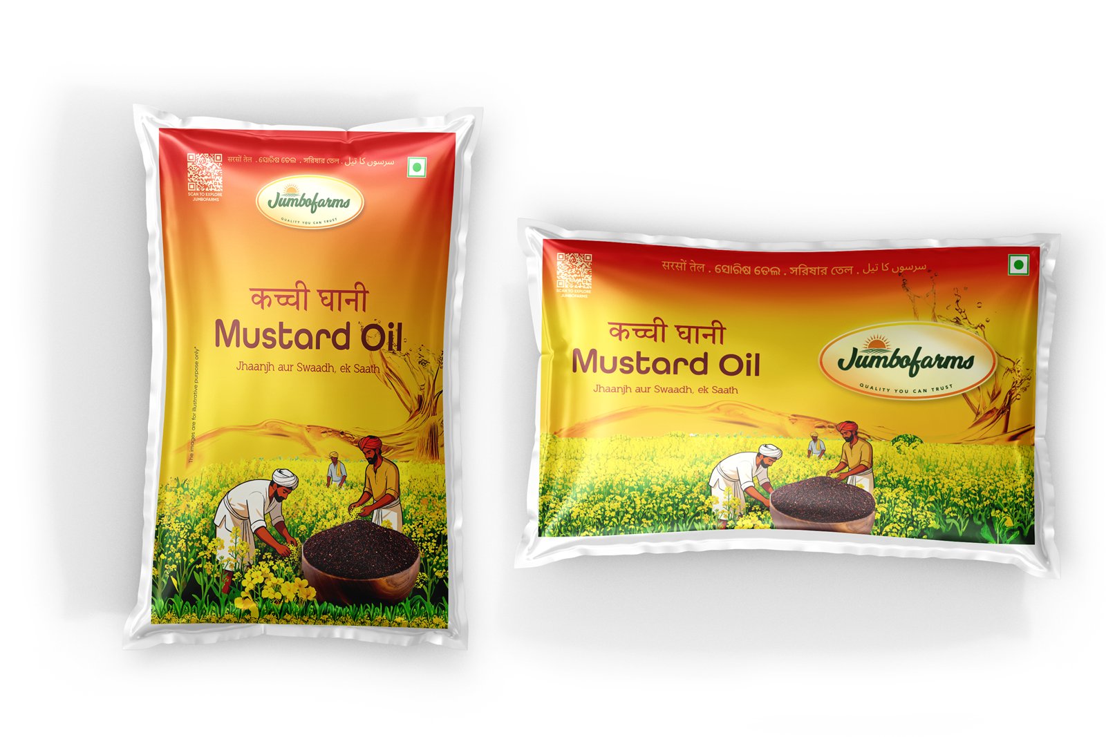
One artwork that had to survive being wrapped round a moulded bottle and printed flat on a pouch, across four sizes and a promotional variant.
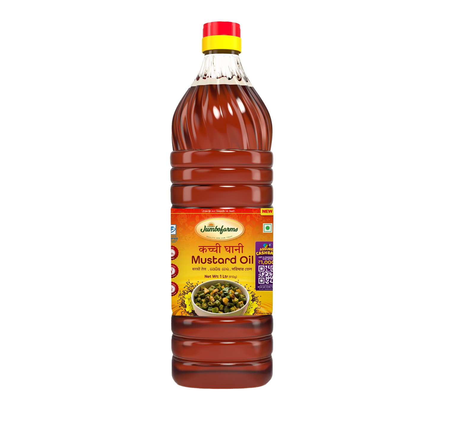
The Hindi is the headline.
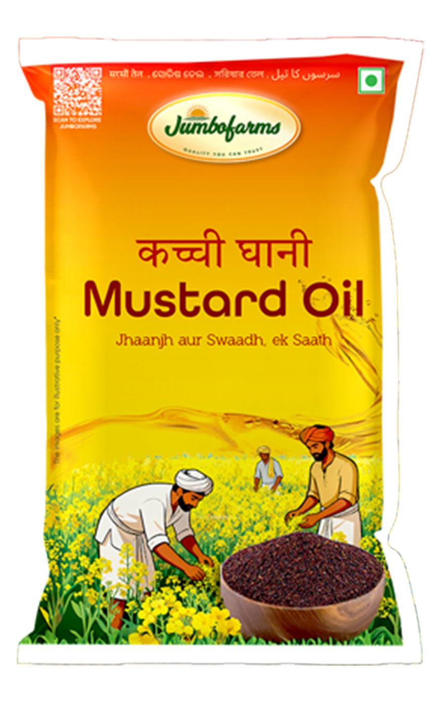
कच्ची घानी sits above “Mustard Oil” and is set larger. Kachchi ghani — cold-pressed in a wooden press — is the thing being bought; mustard oil is the category. Putting the English first would have led with the less useful of the two.
Under it, a line of tagline, then an illustrated mustard field with farmers working it and a bowl of seed in the foreground. Yellow ground throughout, red for emphasis.
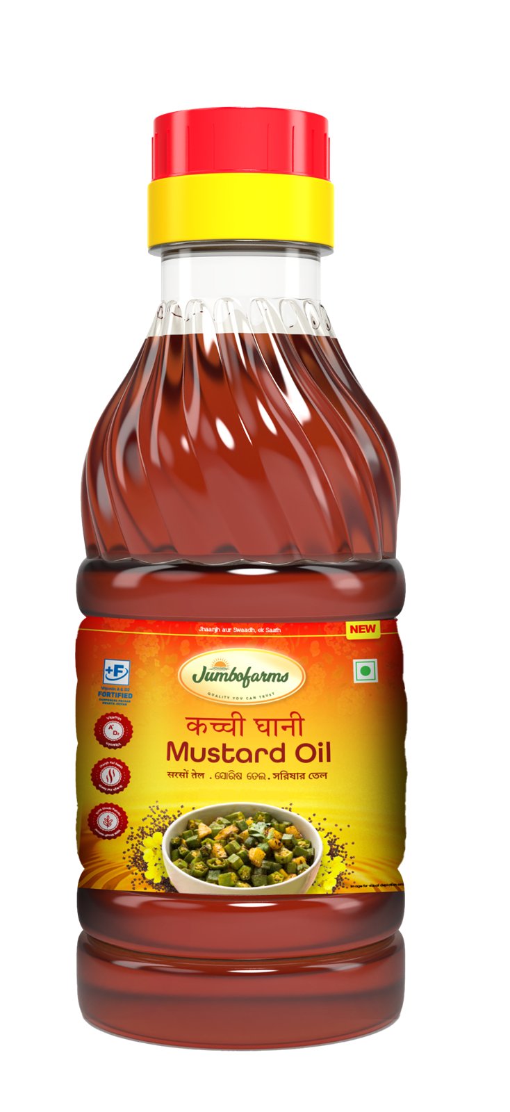
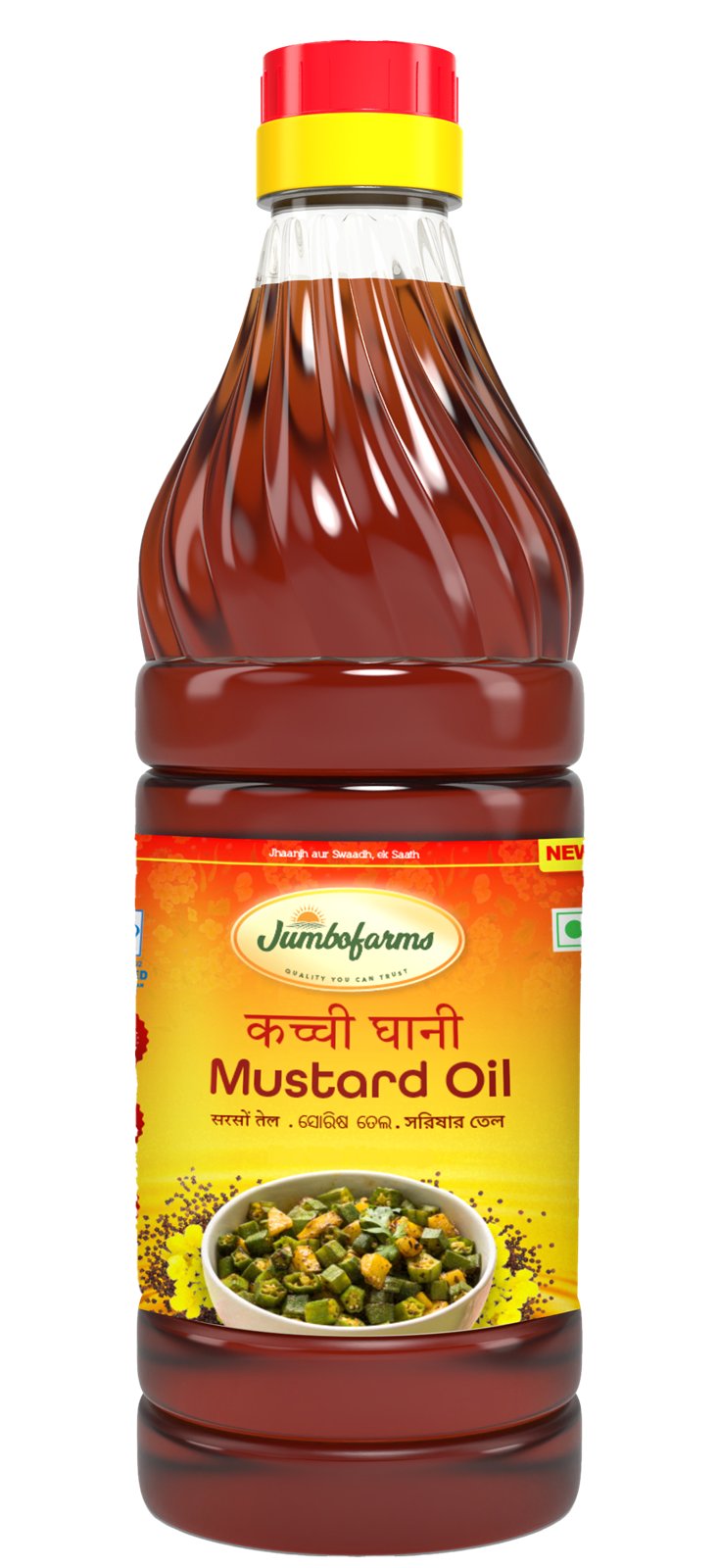
A bottle is not a pouch.
The bottle label is a band: it wraps, so the artwork has to read on a curve and hold together where the ends meet, and the mandatory panel has to fall somewhere that is still legible on a 200 ml body.
The pouch is flat and almost square, which gives the field illustration room to run full width. Same elements, redrawn to fit — not the bottle label stretched.
A campaign that had to fit an existing pack.
The 1 L carries a Scan & Win variant — a QR panel added to a label that was already full. It sits on the side rather than the face, so the pack still looks like the pack, and the promotion reads as an addition rather than a redesign.
5 pieces of artwork.