Crispy
Corner
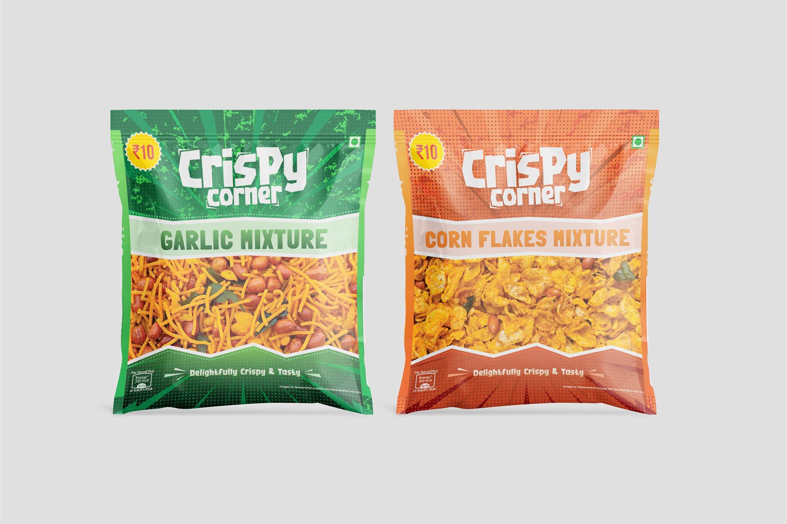
A ₹10 namkeen sachet, where the product is the artwork and the flavour is the colour.
Show the mixture.
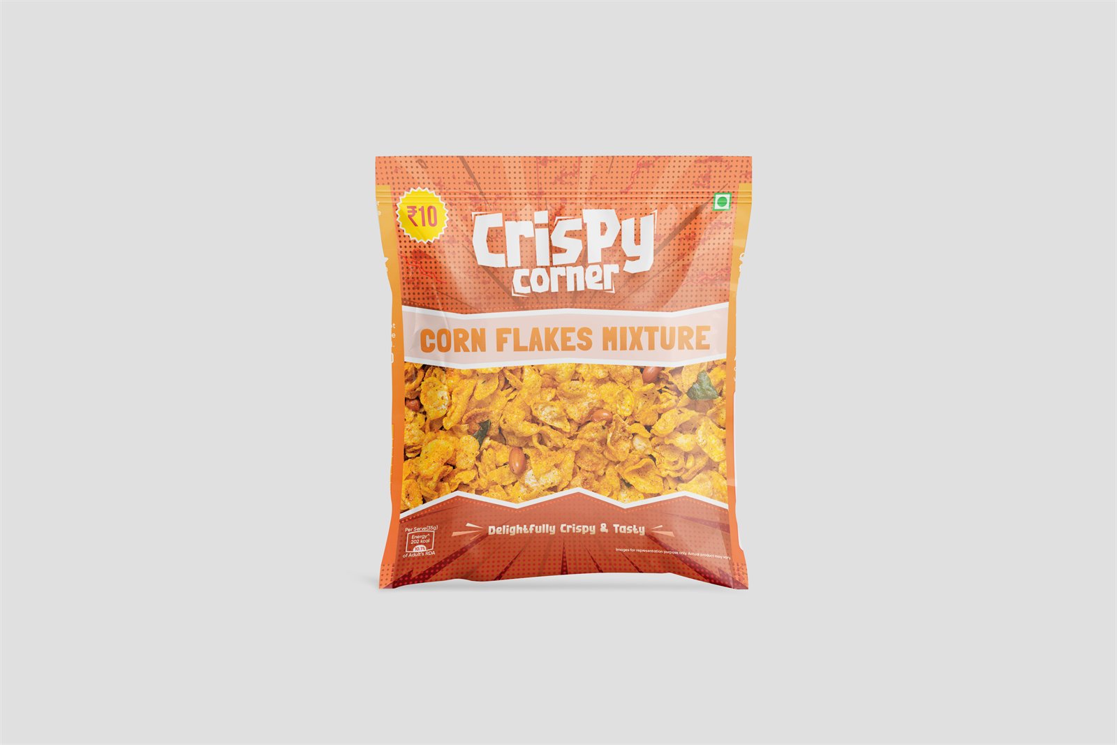
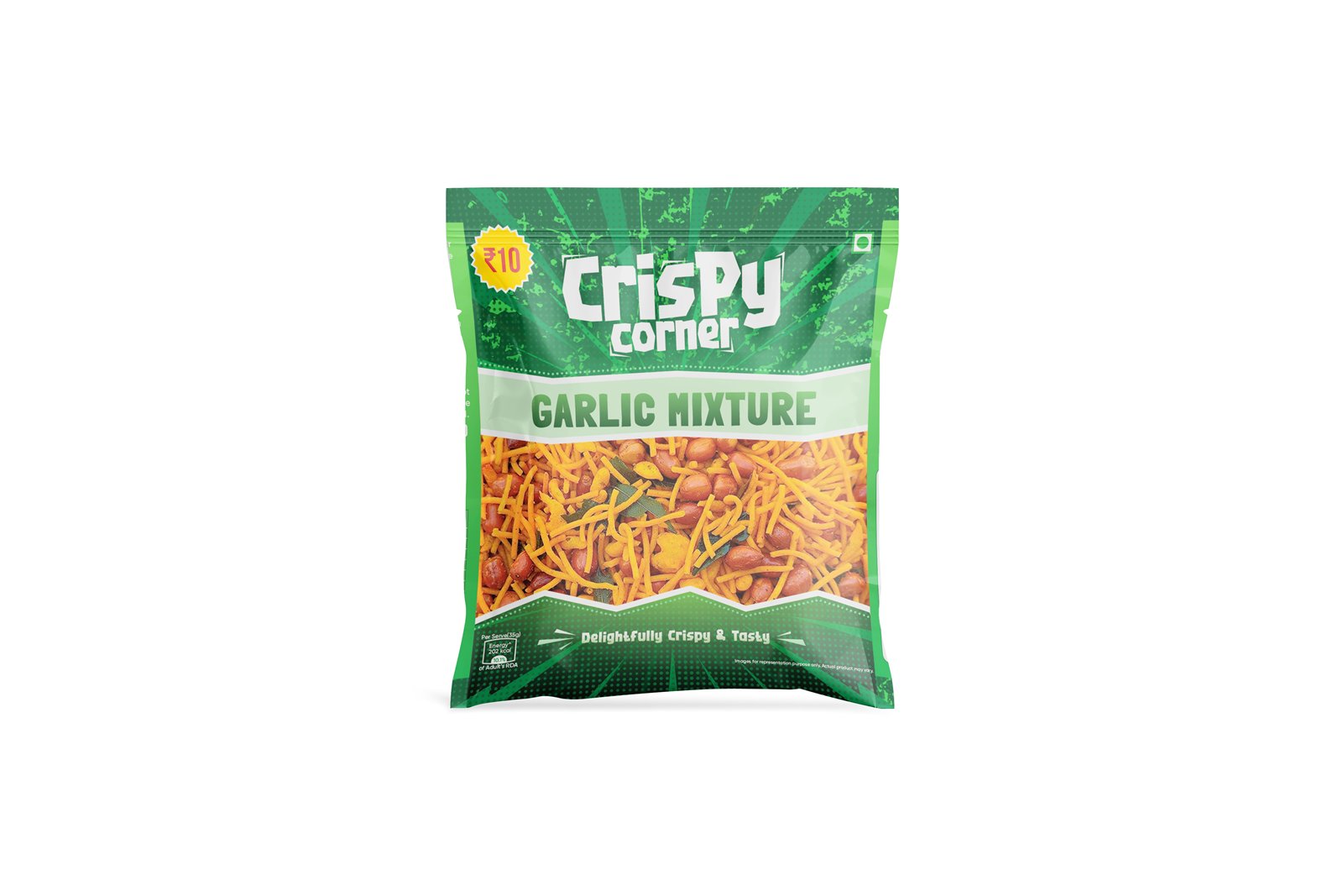
More than half the face is a window onto the namkeen itself, shot large enough that the sev, the flakes and the nuts are individually readable. At a ₹10 price point the product is the only argument that matters, and describing it costs space that showing it does not.
Above it: the ₹10 roundel in the top corner, the Crispy Corner wordmark set in a bouncing script, and the flavour in a pale band. Below it, one line — “Delightfully Crispy & Tasty”.
Orange or green, and nothing else changes.
Corn Flakes Mixture takes orange, Garlic Mixture green. The wordmark, the layout, the band and the window are identical.
Hanging in a strip at a counter, that is the fastest possible read: same brand, different colour, different flavour, no reading required.
3 pieces of artwork.